|
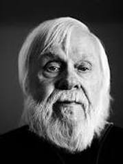
John Baldessari is an American conceptual artist known for his work featuring found photography and appropriated images and he lives and works in California. John Baldessari first began to move away from gestural painting when he started to work with materials from billboard posters. It prompted him to analyze how these very popular and public means of communication functioned and it could be argued that his work ever since has done the same. He invariably works with prexisting images often arranging them in such a way as to suggest a narrative yet the various means he employs to distort them from cropping the images, to collaging them with unrelated images to blocking out faces and objects with colored dots and all force us to ask how and what the image is communicating.
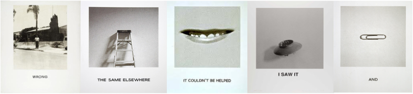
He uses a selection of photographic images anchored by text. The most famous of which titled ‘wrong’ shows an image with poor composition juxtaposed by the text ‘wrong’ bellow the photograph. This image references a chapter on composition in a photography techniques book. The irony of the word is what makes the image so appealing, just blatant judgement of the photograph. The message that he was trying to say in the image is why should we conform to conventional aspects of art or photograph why does our work have to be judged? |
The images below:
Who: John Baldessari
What: His series of 'wrong' images
Where: His hometown
When: 1970's
Why: To get across that our work shouldn't be judged
Who: John Baldessari
What: His series of 'wrong' images
Where: His hometown
When: 1970's
Why: To get across that our work shouldn't be judged
John Baldessari over here was taking bad pictures with random objects like pins, ladders and lips.
The names of the pictures:
First picture: WRONG
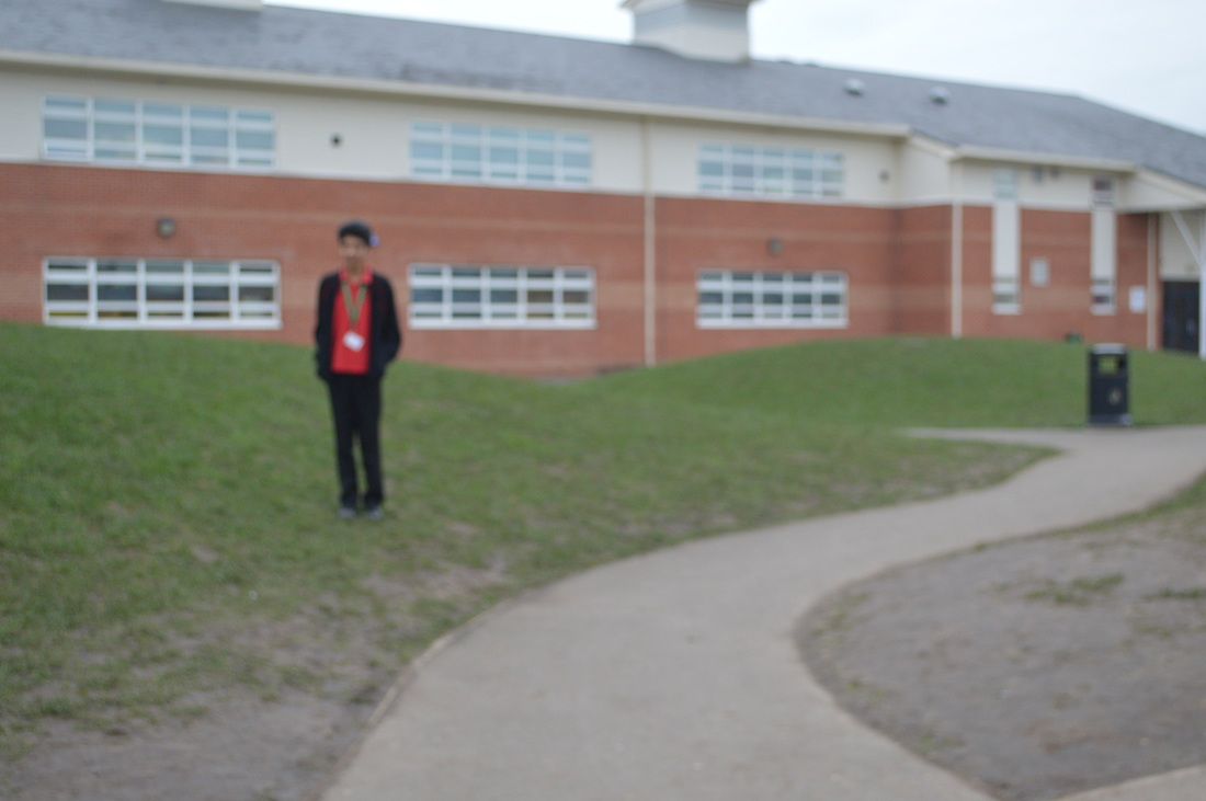
I like this picture because it looks like the person standing in front of the tree has a head as the branch at looks like he is stuck to it and the person has an unclear face which makes us confused as to what it is showing as well as the fact how he is so far back so the image has no main focus point.
Second picture: THE SAME ELSEWHERE
I like this picture because it the ladder matches with the white wallpaper and looks very stylish.
Third picture: IT COULDN'T BE HELPED
I don't like this picture because it's not very interesting with a persons lips and looks very freaky because it looks like the persons lips are in the wall and you can tell it's not on a human because the background is flat.
Fourth picture: I SAW IT
I like this picture because he changed his position of the camera and put the object in the corner of the square an not in the middle which is different compared to the other pictures and the object looks interesting like a olden days toy.
Fifth picture: AND
I like this picture because he used a small object as well but kept the same wallpaper which he could have changed so it doesn't look boring and old and it kind of compares to the ladder because they are both silver and in the middle but one is straight and one is sideways.
The names of the pictures:
First picture: WRONG
I like this picture because it looks like the person standing in front of the tree has a head as the branch at looks like he is stuck to it and the person has an unclear face which makes us confused as to what it is showing as well as the fact how he is so far back so the image has no main focus point.
Second picture: THE SAME ELSEWHERE
I like this picture because it the ladder matches with the white wallpaper and looks very stylish.
Third picture: IT COULDN'T BE HELPED
I don't like this picture because it's not very interesting with a persons lips and looks very freaky because it looks like the persons lips are in the wall and you can tell it's not on a human because the background is flat.
Fourth picture: I SAW IT
I like this picture because he changed his position of the camera and put the object in the corner of the square an not in the middle which is different compared to the other pictures and the object looks interesting like a olden days toy.
Fifth picture: AND
I like this picture because he used a small object as well but kept the same wallpaper which he could have changed so it doesn't look boring and old and it kind of compares to the ladder because they are both silver and in the middle but one is straight and one is sideways.
This video has probably left you extremely confused and wondering what is he doing?
John Baldessari is a conceptual artist master of appropriation and a surrealist for the digital age. He burnt everything he ever made as he was embarrassed at 'normal' artwork. He started to put dots over peoples faces as he found it was more different and funny. The meaning behind a dotted image would generally be that the famous person in the image is still the same as everyone else.
John Baldessari also took a bad composition photo intentionally and called it 'wrong'. His message to everybody that knew him was why should our work be judged?
He has had many photos taken of himself and called it art and there's a clip of him moving his arm slightly whilst repeating 'I am making it'.
To be honest I like his images as they take the phrase 'a picture has a thousand words' into his images. It actually makes me judge his work in order for me to find out what it is and why he is putting coloured dots onto a face in a black and white picture. I like this concept because it's interesting and different. His images make me feel confused as they make me wonder what it actually is and what exactly is he trying to show everyone that looks at his art. One thing with his images is that it has a triangle which is secretly hidden behind the image. As photographers we can point these out and it is effective as it makes it a strong picture.
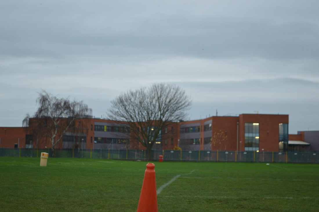
I attempted to take wrong photos like John however it was harder than it you think. We are used to taking so may right pictures with good composition, focus and light that it is very difficult to take wrong photos. We think that we should move the camera the slightest bit to make it look wrong but it's very difficult.
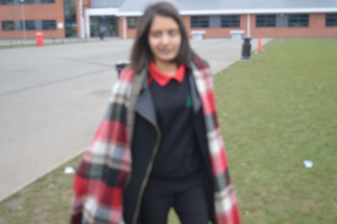
For example I found leading lines and instead of having them lead to a person I had the person stand slightly off track.
For example I found leading lines and instead of having them lead to a person I had the person stand slightly off track.
John Baldassari- 'I will not make any more boring art'
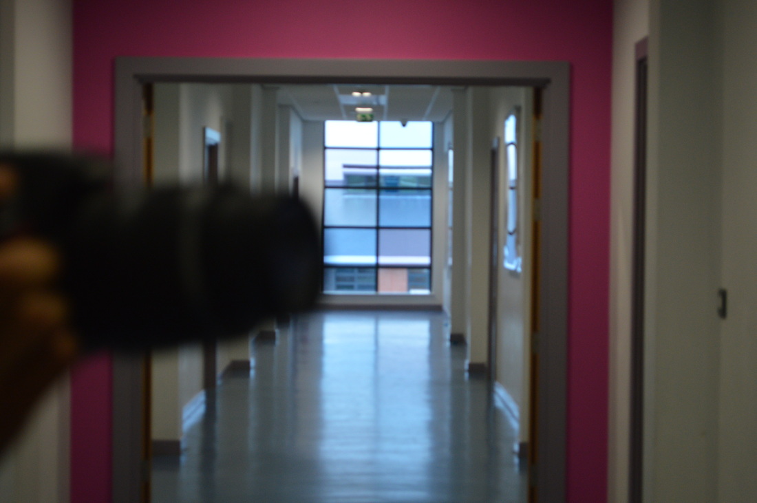
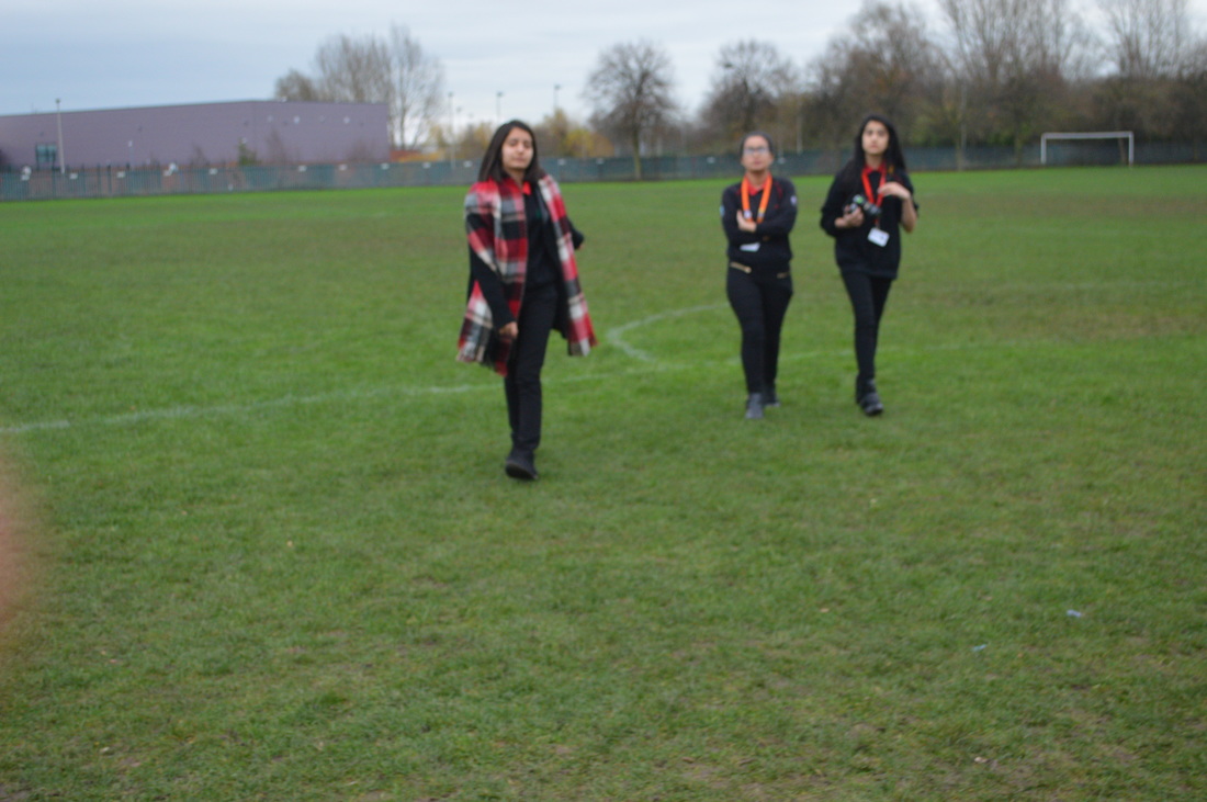
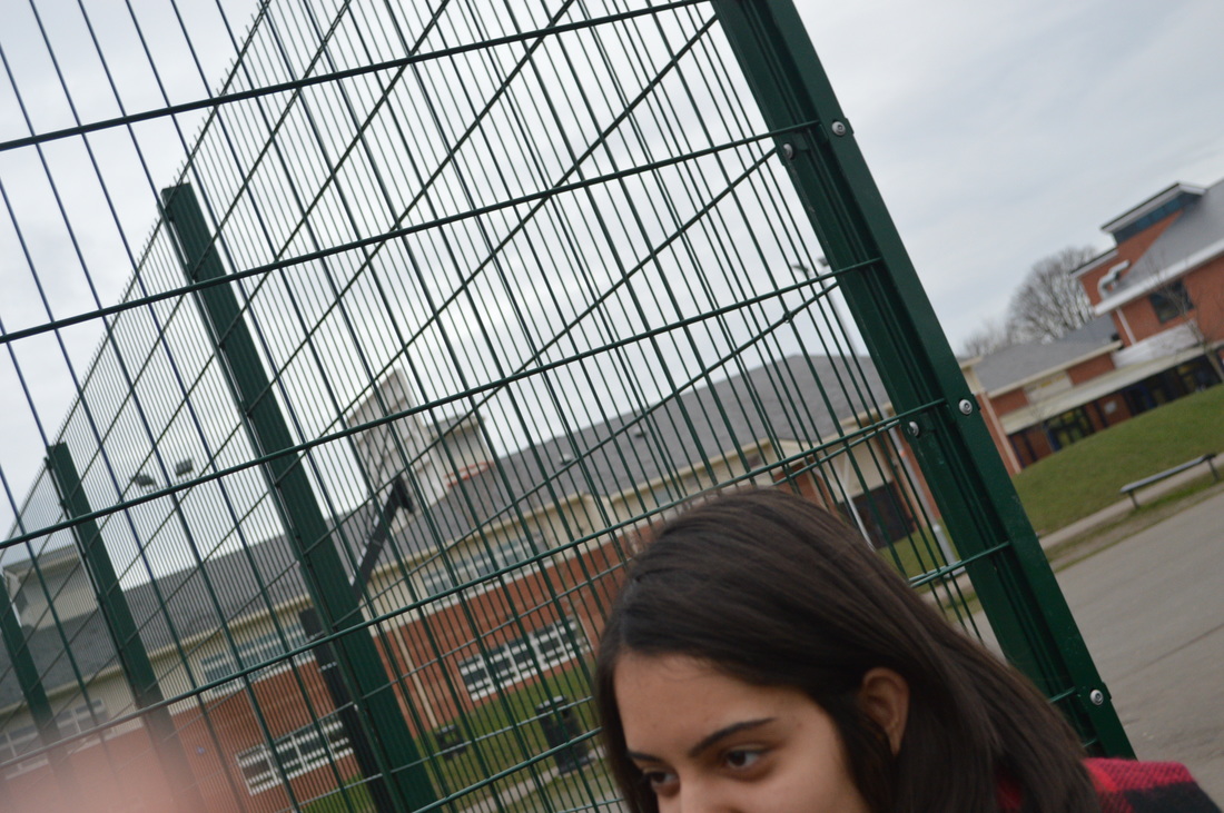
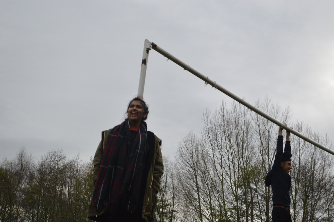
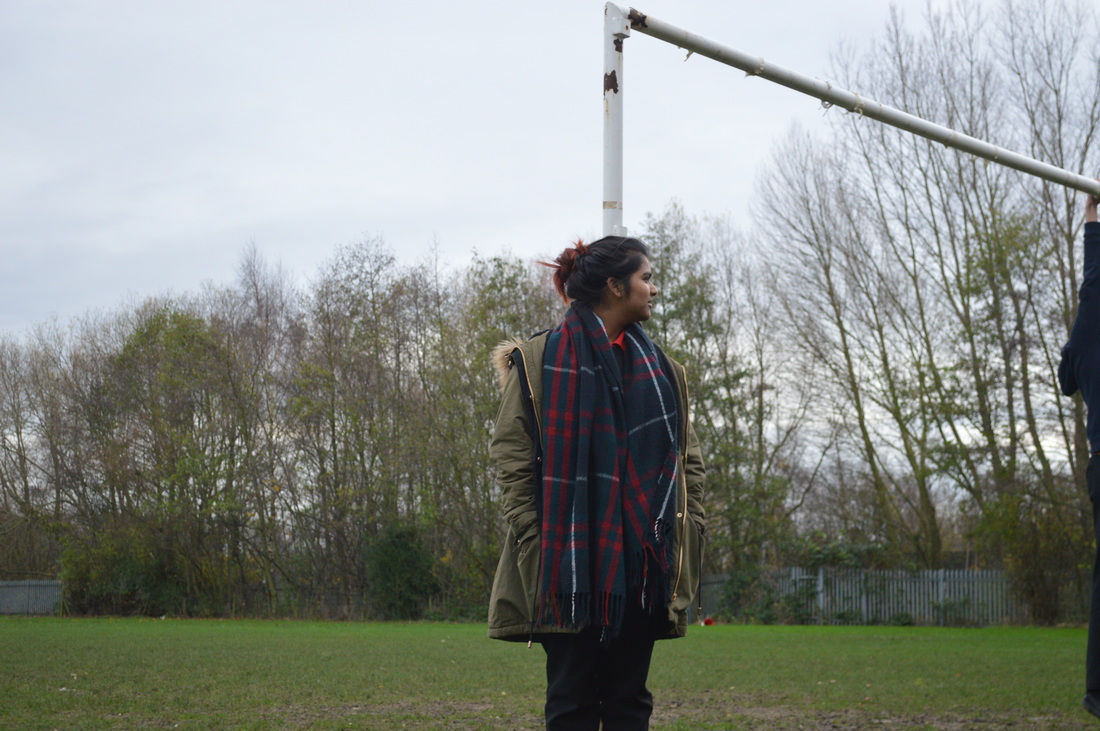
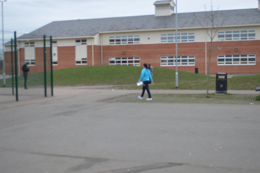
I tried to do the triangle and leading lines in some of my wrong photos. People will be looking at my work at thinking what i'm tying to do and it will inspire them to do the same by taking wrong photos because it's interesting and fun to play around with the camera to attempt doing new things. My influence was from John Baldessari because he really tried to create something new and different with his pictures which inspired me to do the same.
Comparison
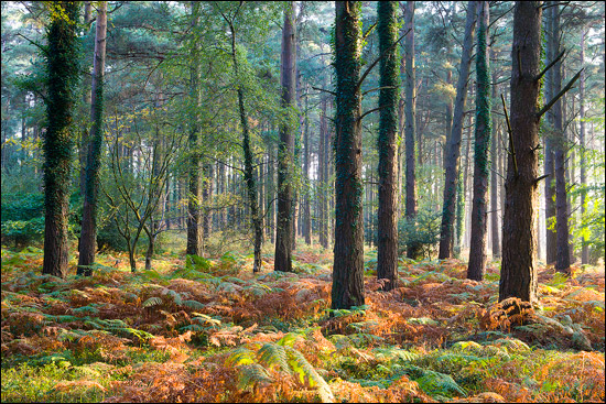
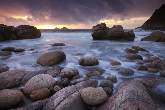
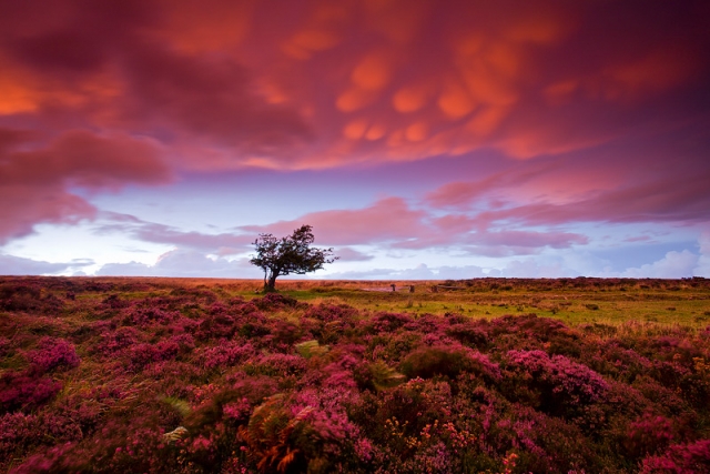
Compared to John Baldessari I think that Adam Burton makes his photos composition right. Also you can tell that he has edited his pictures using a editing software because they look really clear. His images are more straight forward into understanding what they are and although they are good photos John's are actually more interesting to me. Adam Burton takes pictures of landscapes, forests, wildlife and animals which is famous around the world with this topic of photography. His pictures are beautiful and are really inspirational to me because they are really imaginative and lovely.