Home
About
Contact
Foundation course
Post production techniques
>
Photoshop techniques
Development techniques
Camera skills
>
Capturing images
>
Frame
Proximity
Time
Representation
Focus
The exposure triangle
How light works
Photo safari
How to take wrong pictures?
Composition theory
Responding to photographers work
>
Analysis of gcse work
Artist research
Projects
Street photography
>
Artist research
>
Bruce Gilden
Jeff Mermelstein
Christophe Agou
Studio lighting
>
Artist research
>
David Bailey
Richard Avedon
Martin Schoeller
Gregory Crewdson
Yousuf Karsh
Flattering the audience
Natural lighting
Photoshop on portraits
Analyzing on natural lighting pictures
Architecture
>
Mind map
Redesigning Leicester for the twenty first century
Melton road
Architecture in rushey mead school
Architecture opinion
Shapes
My pictures from around Leicester
John Baldessari
Analyzing on melton road
Analyzing on wrong photos
Architecture on photoshop
Own work
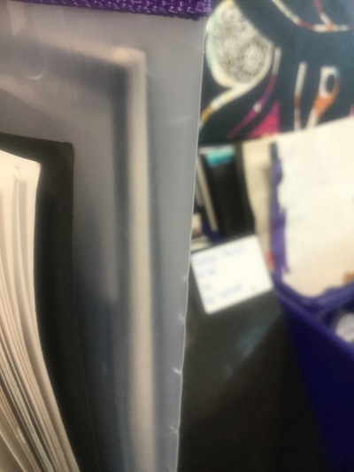
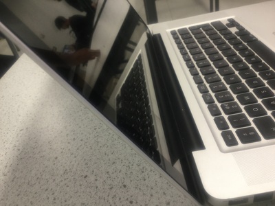
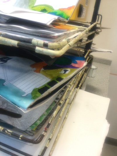
analyzing on wrong photos
This is my first favourite wrong photo because the background is well focused and the folder is clear which was my main focus point which makes the picture really sharp. Also the light is really good because it was natural light from outside which made my picture stand out more without using the flash and the time was in the morning which made the picture look natural and the sun was shining outside which means that it made a shadow on the side of the folder and created a nice atmosphere. As well as this the temperature is right and there is a combination of a wide angle and the lens was zoomed in order for me to take this wrong photo.
This is my second favourite wrong photo because the image had came out really clear with the texture which would feel quite smooth and gentle because the surface is flat and the laptop area has the most clearest subject. Also there are two different shapes in the picture like a triangle in the left hand corner and at the back of the laptop and there are small squares on the keyboard. The picture has a good exposure because it's not too dark or too light which makes it a good shutter speed. I have noticed that the colours combine with each other like the black, silver, white, black and grey and there is a equal balance of those colours and has colour cast and colour accuracy. As well as this the picture is three dimensional because there are different lengths, widths, heights and depths which appears on the laptop. I like this wrong photo because you can see an amazing reflection on the laptop screen because of excellent lighting, contrast and ISO.
This is my third favourite wrong photo because there is a shadow at the bottom of the rack and the light is reflected from the window onto the rail and then on the table which caused a shadow to occur. However the light couldn't have been artificial because I didn't use the flash on the camera or make it by any other sort of way. Also the depth of field is really exceptional because the objects have a bit of distance from each other like the paper at the front is nearer to me but the paper at the back if further away from me which gave it a focused image. Also there is a range of tones from dark to light like the paper at the top is lighter and when each rack goes down it gets darker and it does this from the side too but only at the top when the paper increases where it is first cold and then gets warm. The camera has also captured a motion blur on the rails because of the movement of the camera which does indicate the movement.